Grid node form has the following properties:
Specifies the back color style of every grid within the instances.
Specifies the size of the Cell spacing property of every grid within the instances.
Specifies the size of the Cell padding property of every grid within the instances.
Specifies the paging type of every grid within the instances.
The options are:
- One page at time.
- Infitine scrolling (form scroll bar)
- Infitine scrolling (grid scroll bar)
Specifies the default value for this property on Selection node. This property specifies the number of rows per page that its grid will display. This property can be '<unlimited>', 'Page.Rows' or directly the number of rows that we want the grid to display. If this property is '<unlimited>' the grid will not have paging (all records will be displayed within a grid page). It can be the result of invoking some procedure also, like GetNumberOfRows.udp(&parm1,...)
Specifies how the filters and orders selected will be saved, so that when user returns to it will visualize the same orders and filters that had selected before. The options are: No (will not save filters and orders), In session (will save filters and orders just in session, so that if user closes the application and opens it again the filters and orders selected before will not remain), Custom (allows developer to save the filters and orders as he needs).
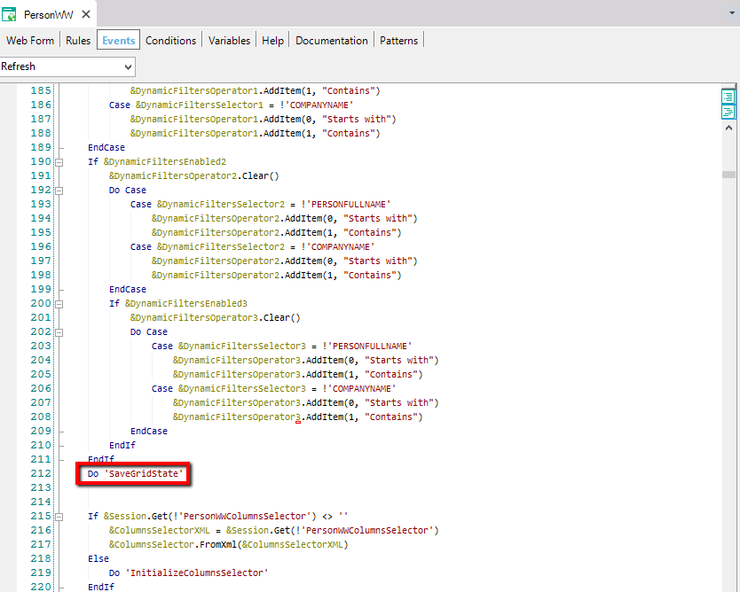
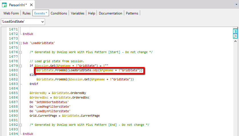
When the property has value 'In session' or 'Custom' it will call to a subroutine 'LoadGridState' in Start Event in order it load the filters and orders saved and also will call to subroutine 'SaveGridState' in refresh event in order to save the changes made in the filters and orders.
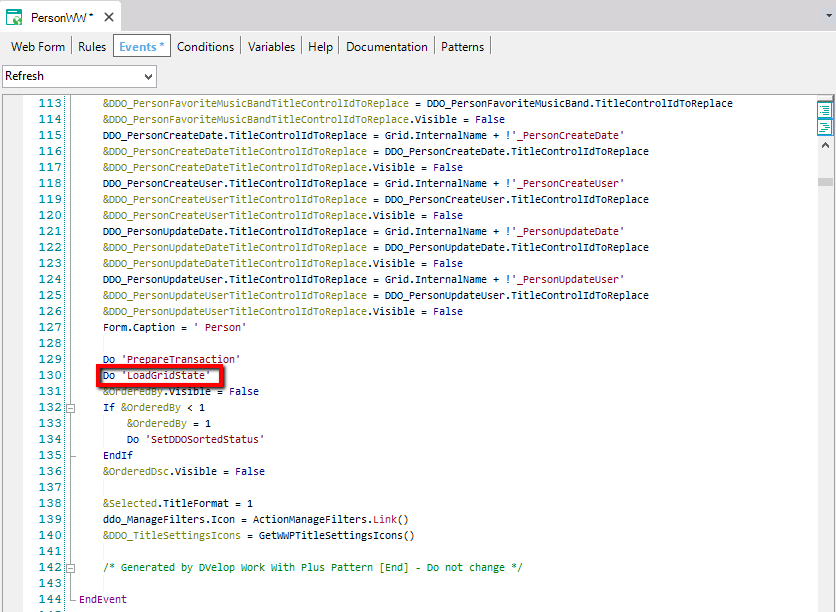
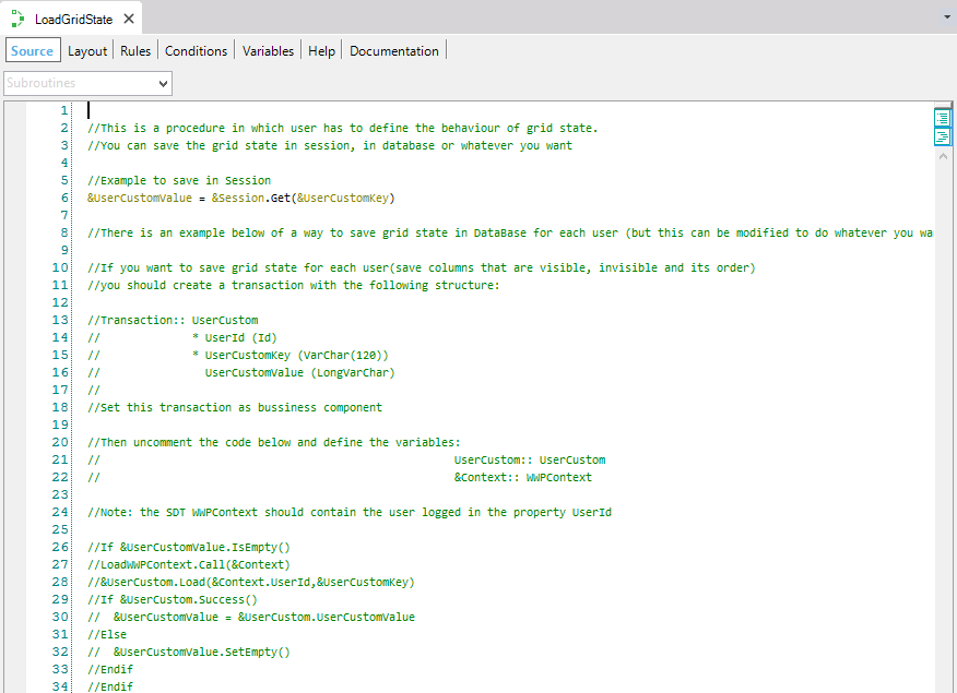
The 'LoadGridState' subroutine will call to a procedure named LoadGridState where developer will add the code necessary in order to load the filters and orders in the way that he needs.
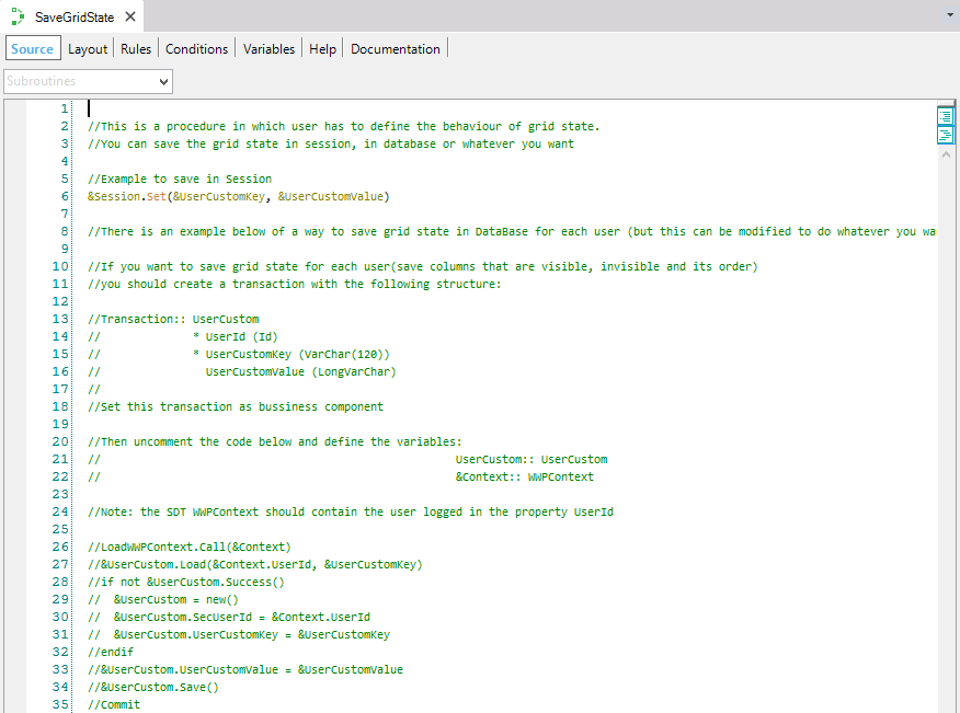
And the 'SaveGridState' subroutine will call to a procedure named SaveGridState where developer will add the code necessary in order to load the filters and orders in the way that he needs.
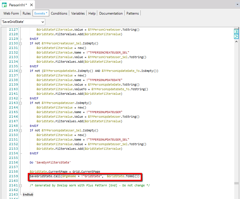
And the procedures LoadGridState and SaveGridState are user procedures (developer will add the code needed). There is a suggestion in order to save filters and orders state in database. You would have to follow the instructions on them:
Specifies how the filters and orders selected will be saved, so that when user returns to it will visualize the same orders and filters that had selected before, in GridTab objects. The values are the same as 'Save grid state' property, so you can visualize an example of it above.
Specifies the SDT that will be used in order to save the state of the filter's grids.
Specifies whether to save or not the current page that the end user is navigating, so that when he goes to another page and returns the grid displays the page he was visualizing at last.
Specifies whether to include the code to save and load the grid state compatible with versions 8 or lower (when saving the state in the Data Base) or not. Only applies if 'Save Grid State' or 'Save Grid State in Tabs' are 'True' respectively.
Specifies the mechanism that will be used in order to send the information of the grid (filters, column filters, orders, parameters, etc). The options are by parameters or by session.
If True, when creating the instances, the description property of the attributes in the grid will be taken always from the Column Title property. If False, when the attributes in the grids are not foreing keys or not inferred, the description will be taken from the Contextual Title property.
Specifies whether to set the property AutoResize in True or False for actions columns in grid.
Specifies whether to set the property AutoResize in True, False or will take its value from property AutoResize of the attribute or variable definition for columns that are not actions in grid. These columns could be attributes or variables.
Specifies whether to set the property NotifyContextChange of Grid in True or False. Only applies if the ColumnsSelector property of grid is false.
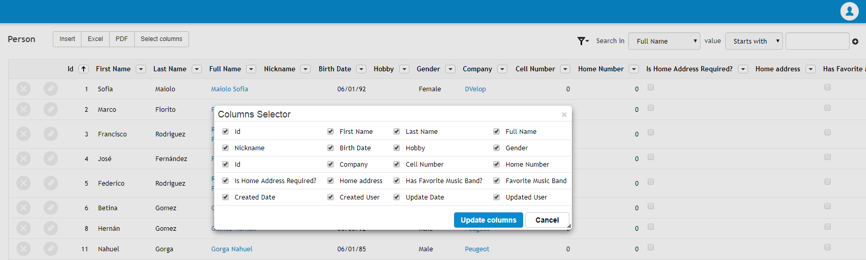
Specifies the default value for this property on instance Grid node. This property specifies whether to generate the grid allowing Columns Selector functionality or not. If this property is True, WorkWithPlus pattern will give the possibility to select at runtime which columns to be visible and which ones not visible. This is useful when we have too many columns in a grid, and user whishes to visualize ones or others depending on what is analyzing.
If you want to read more information about about the Columns Selector, follow this link: Column Selector
Specifies the type of Columns Selector that will be used when you specify that some Grid is Columns Selector. The options are: Free Style Grid and Regular Grid.
Free Style Grid: WorkWithPlus will implement the ColumnsSelector feature using a Free Style Grid. This means that you will have the option to hide/show columns and also reorder them.
Regular Grid: WorkWithPlus will implement the ColumnsSelector feature using a Regular Grid. This means that you will have the option to hide/show columns but you won't have the option to reorder them. Using a Regular grid for ColumnsSelector also allows you to enable selection of rows or add actions which needs to have information of many columns of a record.
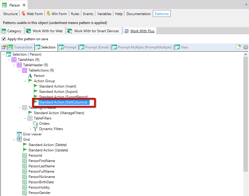
In order to set some grid as ColumnsSelector using Regular grid, it is necessary to add the StandardAction EditColumns within the object's instance:
Specifies whether to calculate the number of records of the grid always, even when the grid is showing the first page. Applies only when ColumnsSelector is enabled.
Specifies whether the new columns that were inserted in the grid will be inserted in the saved configuration of the user. In other words, when some user saves a columns configuration and then the developer adds some new columns in grid, this property will determine if this new columns will be added in the user configuration or not.
Specifies whether to save the state of the columns (columns configuration) in session or not. This is useful when the configuration of columns is not saved for each user in DB.
Specifies the default value for this property on variables or attributes inside a grid. This property in attributes or variables specifies whether the records of the grid will be sortable by cliking in that column. Applies for attributes or variables inside regular grids of a grid object.
:
Specifies the default value for this property on variables or attributes inside a free style grid. This property in attributes or variables specifies whether the records of the grid will be sortable by cliking in that column. Applies for attributes or variables inside free style grids of a grid object.
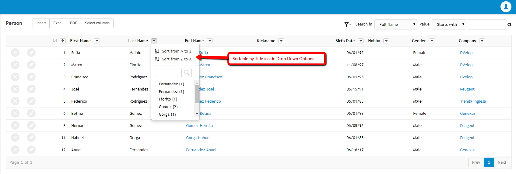
Specifies whether the option to sort a grid column (attribute or variable) will be inside the Drop Down Options always or just when the Drop Down Options is created for other reason (for having column filtering). The Drop Down Options is the following:
Specifies the default value for this property on Orders node. This property specifies whether the orders combo will be visible or not, when the orders node contains more than one order.
Specifies the color to asign to the selected row in grid. This property will set the value of 'Selection color' in grid. Only applies in grids that has Allow selection property in true.
Specifies the color to asign to the hovered row in grid. This property will set the value of 'Hovering color' in grid. Only applies in grids which has Allow Hovering in property true.
Specifies the type of all the grids by default. The values for this property are GeneXus and all the Custom Render of grids that are installed in your version of GeneXus.
Specifies whether the actions will have the possibility to change its size or not.
Specifies whether the actions will have the possibility to hide them or not.
:
Specifies whether the menu of that action will be disabled or not. Is the menu that contains some functionalities relationed to the action column.to order the grid by that column, or set it as hidden.
Specifies whether the columns of attributes or variables will have the possibility to hide them or not.
Specifies whether the menu of that column will be disabled or not. Is the menu that allows to order the grid by that column, or set it as hidden.
Specifies whether it will have the possibility to move the columns of the grid or not.
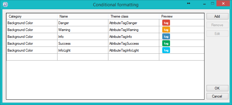
Specifies the possible format options that will be available to use when setting some conditional formating to a row or column.
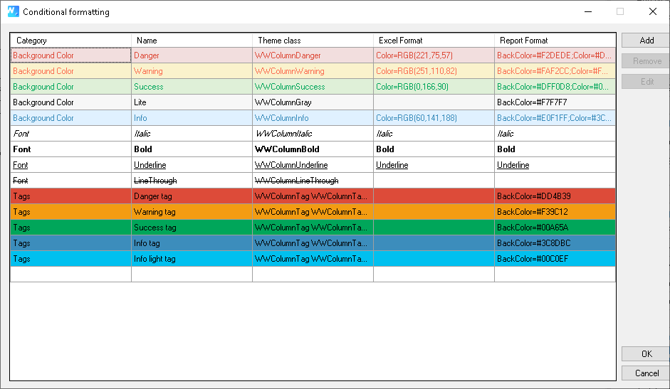
These are the ones that come by default when importing a theme. You can create new ones, edit the existent ones or remove them.
Specifies the cateogory of the format. When yoy creating a row formatting condition you will have to select one category.
Specifies the name of the format. Then, when creating a row formatting condition you will have to select one of them by name.
Theme class:
Specifes the name of the class that will be assigned to the column of the grid, or to the whole row, when the condition is accomplished. WorkWithPlus displays a preview of how the column of the grid will look like when using these formats.
For each one, you can include more than one format separated by ';'. The possible values are: Italic, Bold, Underline and Color:<COLOR_NUMBER> (i.e: Italic;Bold;Color=RGB(221,75,57). Note: The Color format must be set as the last format.
The conditional formatting options supported for Excel files are row conditional formatting and column conditional formatting.
For each one, you can include more than one format separated by ';'. The possible values are: Italic, Bold, Underline, BackColor:<COLOR_HEXA> and Color:<COLOR_HEXA> (i.e: Italic;Bold;Color=#F2DEDE)
The conditional formatting options supported for Report files are row conditional formatting.
Specifies the possible icon tag options that will be available to use when setting some conditional formating to a row or column.
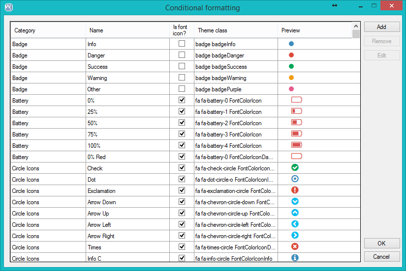
These are the ones that come by default when importing a theme. You can create new ones, edit the existent ones or remove them.
Specifies if the icon tag is an icon or not.
In this column will be show the preview of the icon tag.
Specifies the possible text tag options that will be available to use when setting some conditional formatting to a row or column.
These are the ones that come by default when importing a theme. You can create new ones, edit the existing ones, or remove them.
Specifies the position of the tooltip displayed for the tag column. The options are Automatic, Left, Top, Right, Bottom. Automatic will display the tooltip on the position where it enters (for example, if the column is on the left it will display it to the right, etc.)
FixedColumn Default Value
It specifies if the columns of the grids are going to be fixable or not.
|