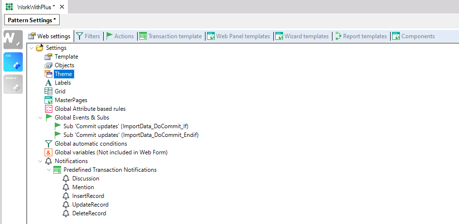
Themes node has the following properties:
| Category |
Property |
|
| General |
Theme |
 |
| Theme Class |
Button |
| Disabled Button |
| Image |
| Text To Link |
| Plain text |
| Att / Var Right Text |
| Grid |
| Allow Selection Grid Suffix |
| Column Selector table |
| Column Selector Free Style Grid |
| Table |
| Group |
| Table for Geolocation Attributes |
| Grid User Action Image Class |
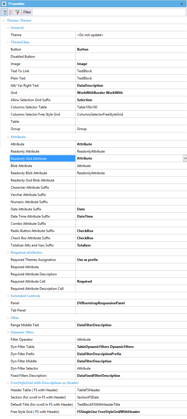
| Attribute |
Attribute |
| Readonly Attribute |
| Readonly Grid Attribute |
| Blob Attribute |
| Readonly Blob Attribute |
| Readonly Grid Blob Attribute |
| Character Attribute Suffix |
| Varchar Attribute Suffix |
| Numeric Attribute Suffix |
| Date Attribute Suffix |
| Date Time Attribute Suffix |
| Combo Attribute Suffix |
| Radio Button Attribute Suffix |
| Check Box Attribute Suffix |
| Totalizer Atts and Vars Suffix |
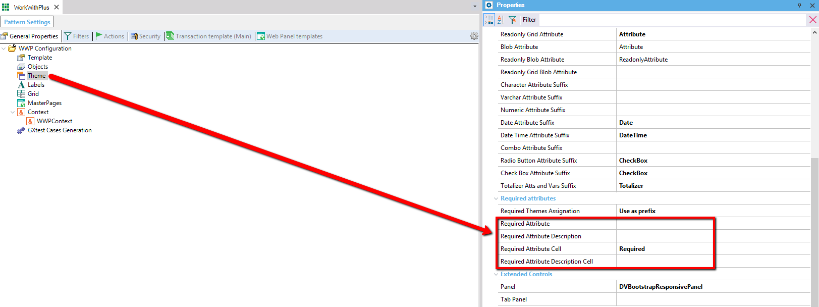
| Required Attributes |
Required Themes Assignation |
| Required Attribute |
| Required Attribute Description |
| Required Attribute Cell |
| Required Attribute Description Cell |
| Extended Controls |
Panel |
| Tab Panel |
| Filter |
Range Middle Text |
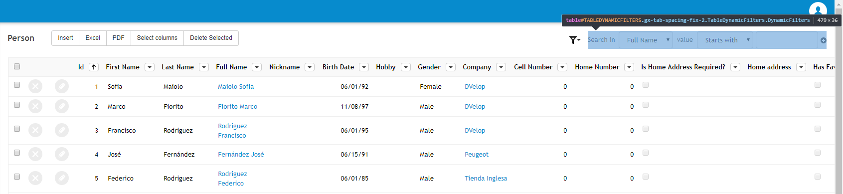
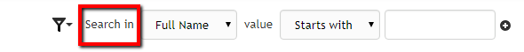
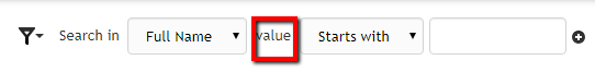
| Dynamic Filter |
Filter Operator |
| Dyn Filter Table |
| Dyn Filter Prefix |
| Dyn Filter Middle |
| Dyn Filter Selector |
| Fixed Filters Description |
| FreeStyleGrid with Descriptions as Header |
Header Table (FS with Header) |
| Section (for Scroll in FS with Header) |
| Default Title (for Scroll in FS with Header) |
| Free Style Grid (FS with Header) |
Specifies the theme object that will be set to all objects generated by the pattern if Set object theme property is True. If this property is empty, theme will be taken from KB's Default Theme property.
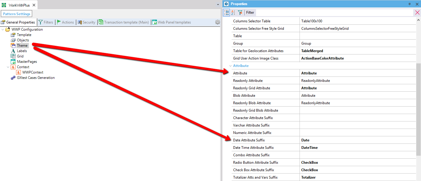
All the properties inside this category specifies the default theme class for different objects or node types.
The following properties specifies the class to be assigned by default to attributes of this kind.
Properties:
- Attribute
- Readonly Attribute
- Readonly Blob Attribute
- Readonly Grid Blob Attribute
- Grid Check Box Attribute (apply only for Multi Row Selection and Association Selection)
The following properties specify a suffix that will be set to each type of attribute when is not Read only. Applies for attributes and variables.
Properties:
- Character Attribute Suffix
- Varchar Attribute Suffix
- Numeric Attribute Suffix
- Date Attribute Suffix
- Date Time Attribute Suffix
- Combo Attribute Suffix
- Radio Button Attribute Suffix
- Check Box Attribute Suffix
- Totalizer Atts and Vars Suffix: specifies the suffix to be assigned to the class of the variable that is included automatically by WorkWithPlus at the bottom of the grid displaying the totalizer of that column.
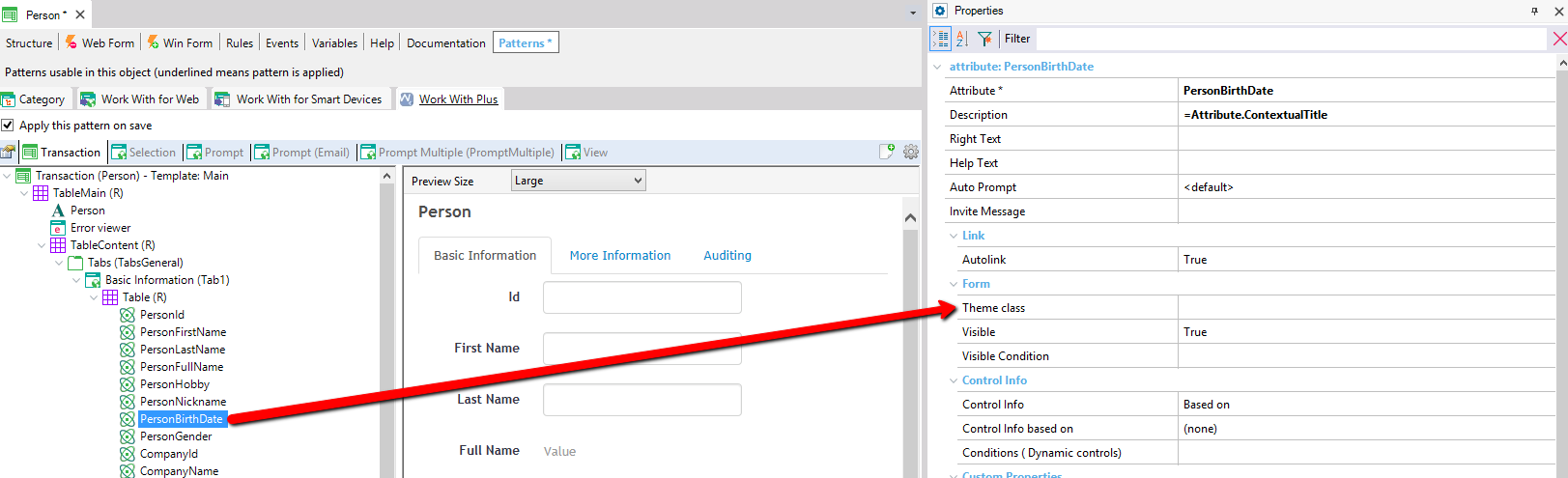
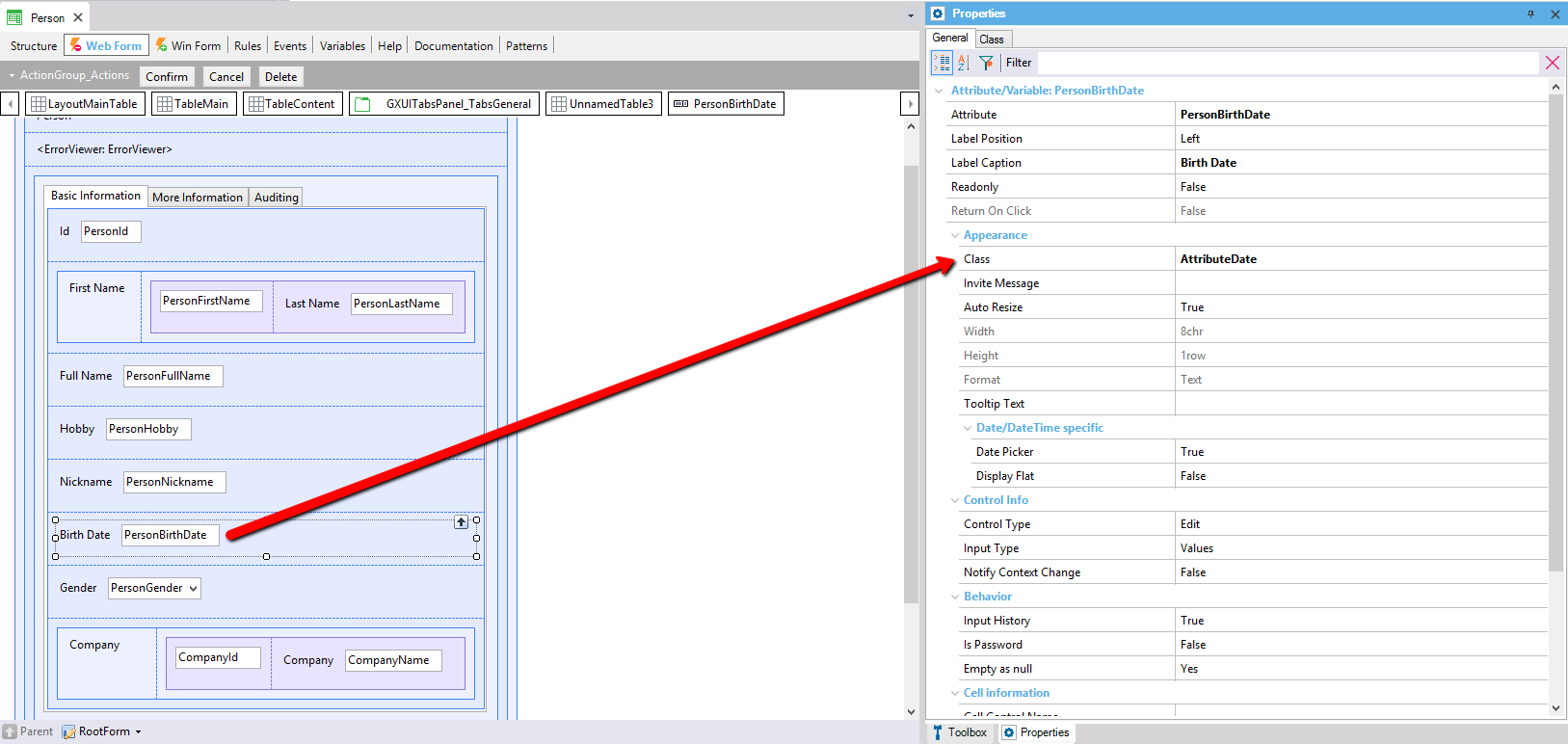
If the value of the property 'Theme class' of an attribute node in a transaction is 'Att', and the type of this attribute is Date it will assign: Attribute + Property 'Date Attribute Suffix': AttDate
If the value of the property 'Theme class' of an attribute node in a transaction is empty, it will take the default value of Web Settings -> Theme -> Attribute + the right suffix (depending on the type of the attribute): AttributeDate (see images below).
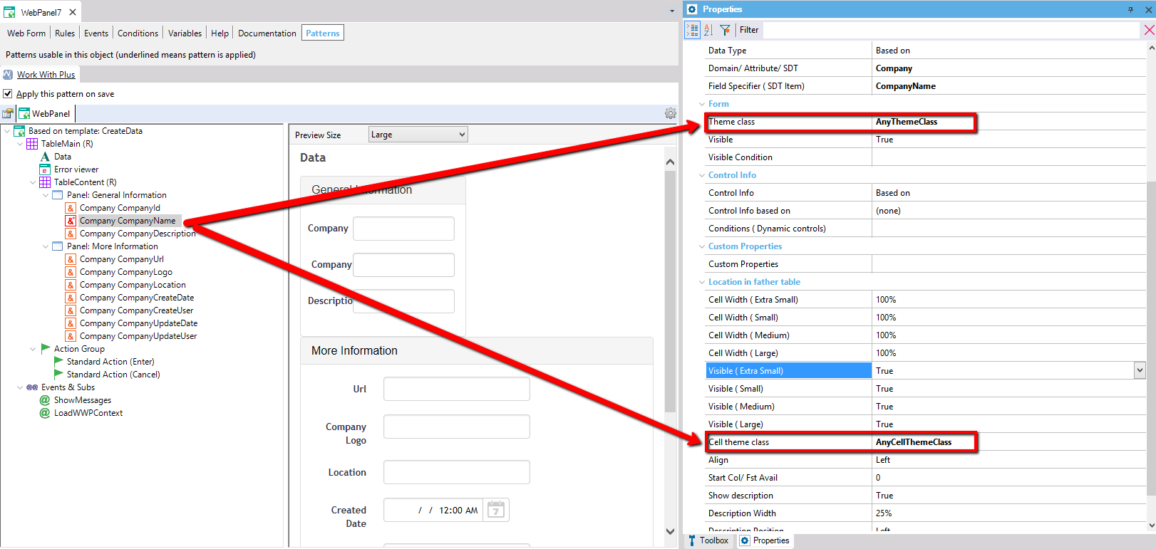
Specifies the themes classes or prefix to be assigned to the attributes or variables that are required.
Specifies the theme classes that WorkWithPlus will assign to required attributes and variables. The options are: 'Fixed Classes' or 'Use a prefix'.
- Fixed classes: it will assign the classes that are defined in the properties named Required Attribute, Required Attribute Description, Required Attribute Cell and Required Attribute Description Cell. These properties are in Theme node. It won't take into account the values of the properties Theme class, Description Theme class, cell theme class and Description cell theme class of the attribute or variable.
For example, if you have a required variable or attribute with the following properties:
And the properties of WorkWithPlus Theme node are the following:
The required variables will have the following properties:
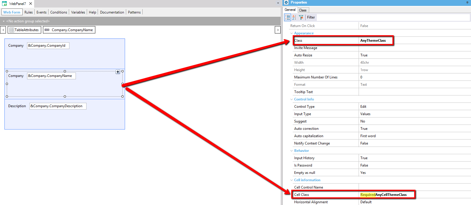
- Use a prefix: the classes assigned to the required attributes will be a concatenation of the properties mentioned above and the values of the properties of the attribute/variable itself.
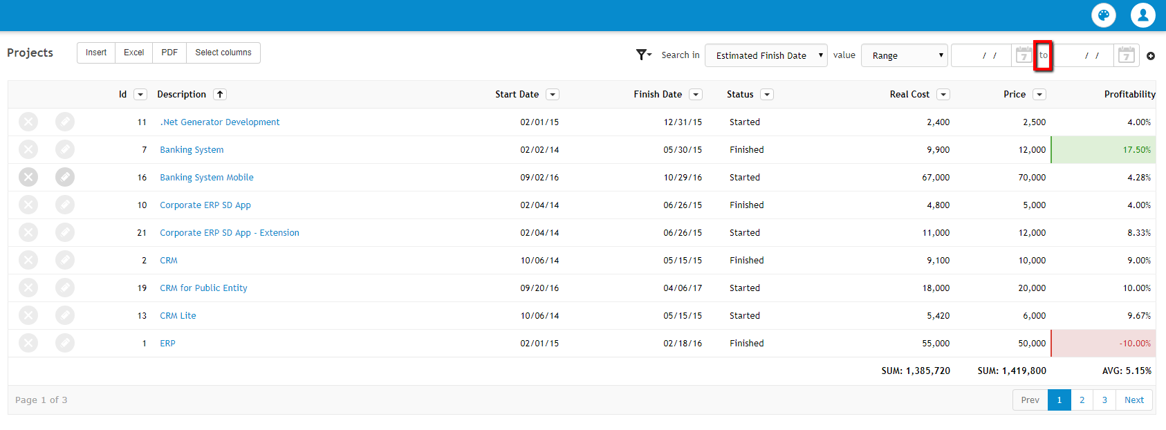
Specifies the theme to apply to the text that goes in the middle of the Range filter.
Theme to apply to the control which contains the operators. This control is included when you insert a filter with dynamic operators or a dynamics filters node.
Theme to apply to the table which wraps all the controls of the dynamic filters.
Theme to apply to the label that is next to the combobox with the attributes.
Theme to apply to the label that is between both comboboxes.
Theme to apply to the combobox which contains the operators to apply to an attribute.

Specifies the theme class that will be assigned to the filter's description. Only applies when the filter is inside the FixedFilters node.
|