WorkWithPlus
Grid Attribute node has the following properties:
Attribute´s name.
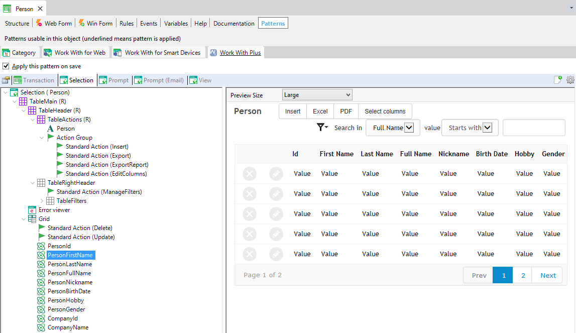
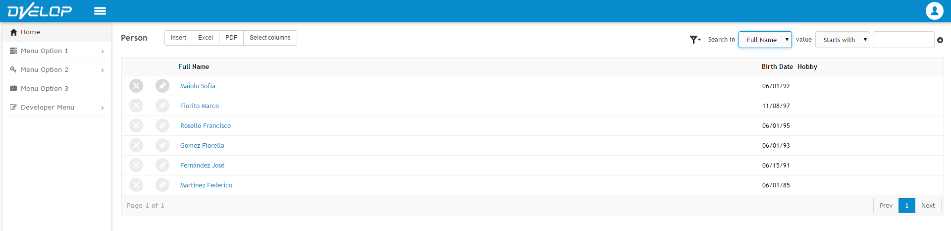
Attribute´s description. Represents the title of the attribute´s column in grid .For example, attribute: PersonFullName and description: Full Name, as we can visualize below:
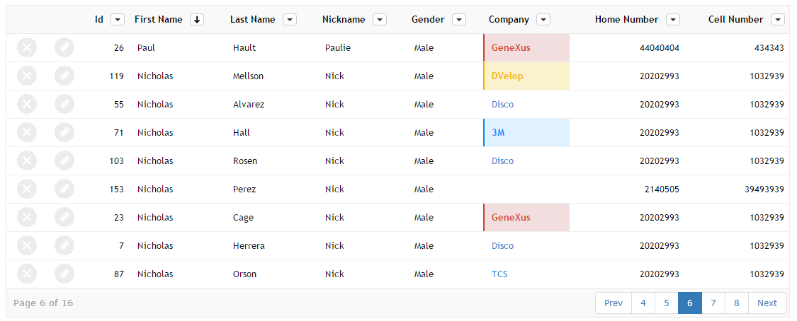
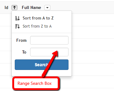
Specifies whether the column will have the possibility to be sorted by clicking on it or not. This sorting will be server side, so will sort all the records and not only the visible ones. The values for this property are:
- <default>: will take its value from WWPConfiguration -> Grid -> Property Sortable by Titles
- True: will add the possibility to click on that column and order the records ascendant or descendant by that attribute
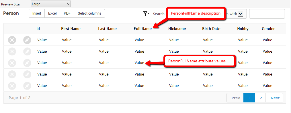
- True (Order 'SomeOrder'): will add the possibility to click on that column and order the records ascendant or descendant by that Order. The Order is a child node of Orders. For example, for PersonFullName we have the following options:
TitleSorting can be used un Genexus grids, ColumnsSelector grids or GXUI grids.
For visualizing some example images of title sorting, and more information about it, follow the link: Title Sorting (Server Side)
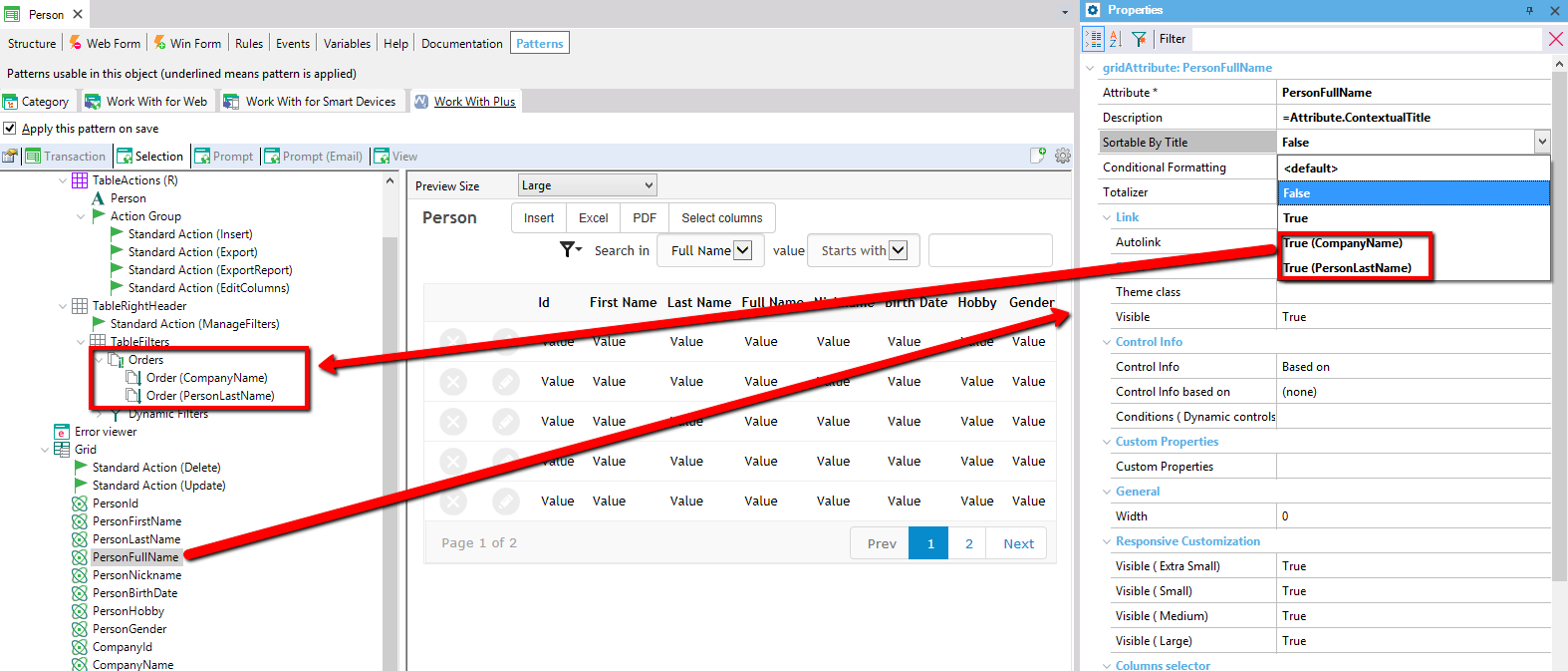
Specifies the conditions that will apply different formats to this column. By default it will be blank, but you can add as many as you want.
Example:
In the following link you can read more about Conditional Formatting
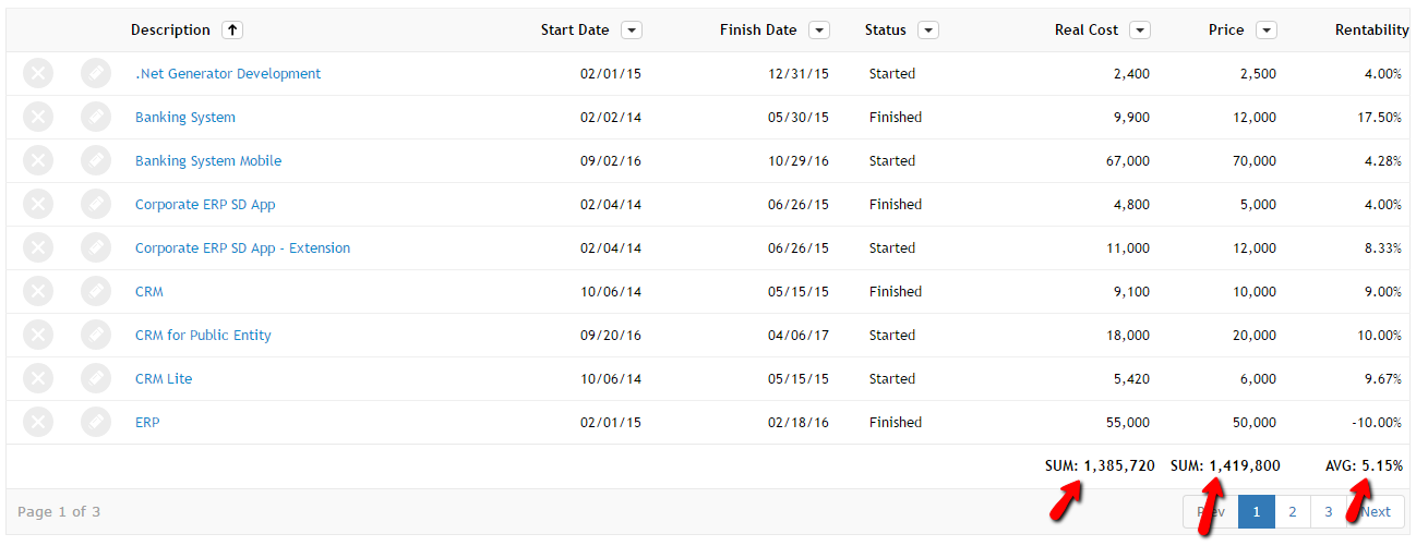
Specifies the type of totalizer that will be apply for the column. The values for this property are:
- False
- Sum: it will sum the attribute value of all the records that are being shown in the grid (from all pages).
- Average: it will calculate the average of the attribute value considering all the records that are being shown in the grid (from all pages).
If you set Sum or Average at runtime it will display the formatted value for each totalizer:
In the following link you can read more about Totalizers
In the following video you can see an overview of this functionality:
Specifies whether to generate links to other instances of the pattern through its description attributes. It only applies if the grid attribute we are modifying represents a description attribute of some transaction. It has the same meaning of Autolink property in an attribute node with the difference that the attribute is inside a grid (if you want to see examples about it open Attribute node).
Attribute´s theme class. If t his field has an empty value the theme class that will be assigned to the attribute will be taken from WorkWithPlus Configuration > Theme node > properties Attribute, ReadOnlyGridAttribute and ReadOnlyGridBlobAttribute.
Specifies whether the attribute will be visible inside its grid or not.
Specifies a condition that will determine whether the attribute will be visible or hidden.
Specifies the column class to apply to the grid column.
Specifies whether the variable will have a specific control type based on some domain/attribute, etc or will be defined customized. If you leave this property in its default value (based on) with empty value in 'Control info based on' property the control type of the variable will be the same as its definition.
Depending on the value of 'Control Info' property some properties are visible or hidden automatically.
Specifies the domain or attribute in which the variable's control info will be based on.
Specifies the conditions to be added to the control (only if the control is Dynamic Combo, Listbox or Suggest).
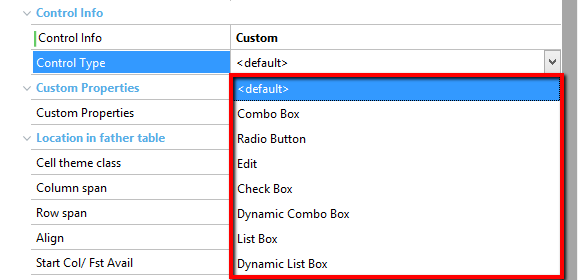
Specifies the attribute's control type.
Most of the options that GeneXus allows for control types are supported in this property:
Gives the option to assign specific properties to attributes, properties that are not available within the attribute node. This should be used in just a few cases. Detailed info: Custom Properties for Grid, Attributes and Variables
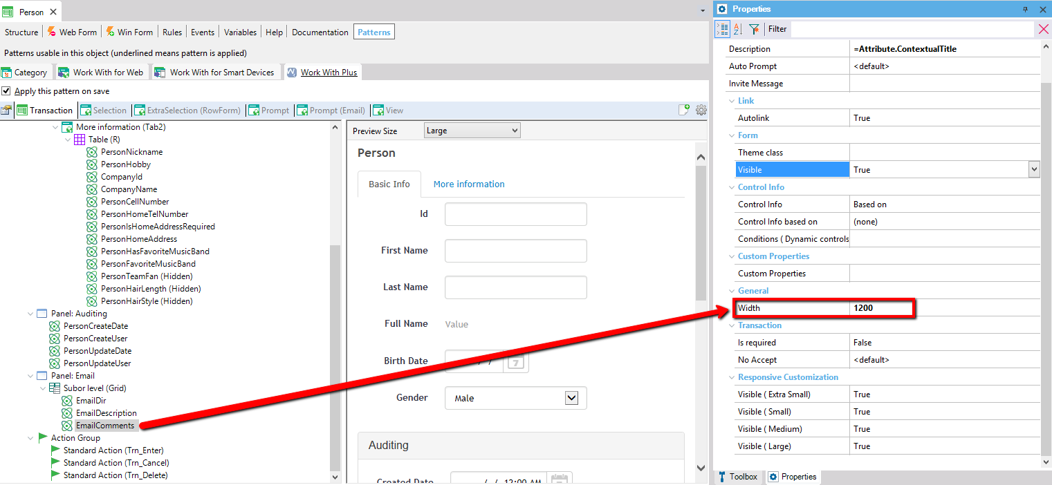
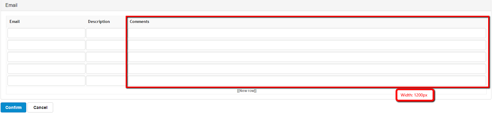
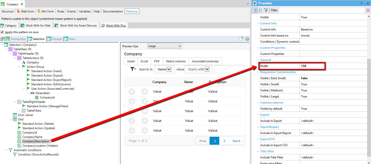
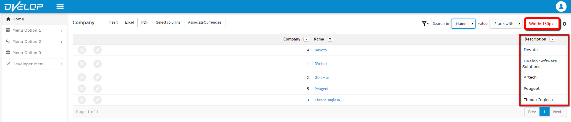
Specifies the width of the column where the attribute will be displayed. If the value is 0 it will base its value on the Autoresize property within the definition of the attribute. This applies for editable attributes and read only attributes, but not within Column Selector grids.
We set width = 150px to the attribute 'CompanyDescription' within the grid of Selection object and visualize the results:
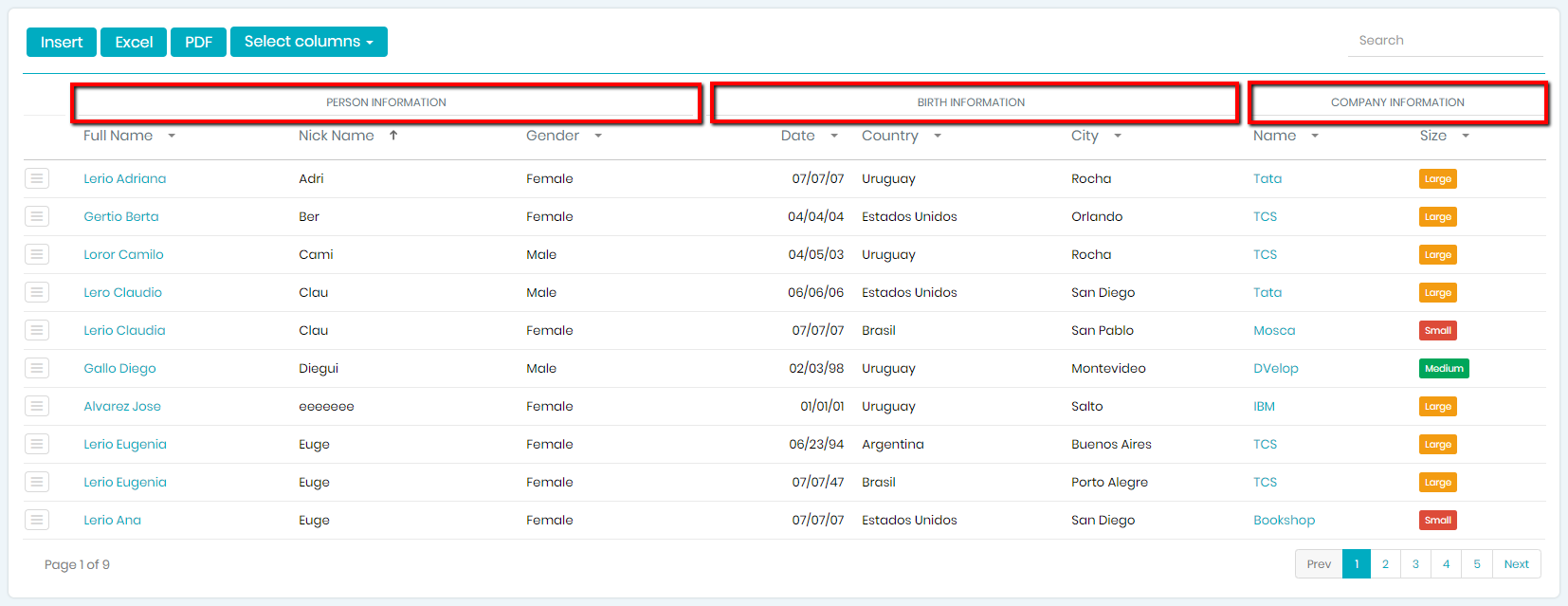
Specifies the desired category for this attribute within the Grid. You should set the desired text that will be displayed above the Column Title in the Grid.
For example:
With these properties, you can set whether the attribute will be visible in the different browser sizes. For example, you can set that is visible when the browser is Large and not visible when the browser is Extra Small. The possible values for these properties are true or false.
Specifies whether the attribute will be visible by default in the grid. In other words, specifies if the attribute will be visible as the page loads its first time (WWPerson for example) . Only applies when the Column Selector property of node that contains it is True, and for Selection and Grid Tab objects. If the attribute has its Visible property on False, this property is not valid because the attribute would never be visible.
For example, in WWPerson we set the following properties to the grid attributes:
- PersonFullName, PersonBirthDate, PersonHobby>> Visible by default: true
- PersonGender, CompanyName >> Visible by default: False (it will be invisible at first but user will be able to set them visible)
- PersonFirstName, PersonLastName >> Visible: False (it will be invisible and user will not be able to set it visible)
The property Column Selector in grid must be True. Then we apply the pattern and run the application:
The attributes visibles when the application loads are the ones that have Visible by default property on True. Then, if we visualize the option to edit columns:
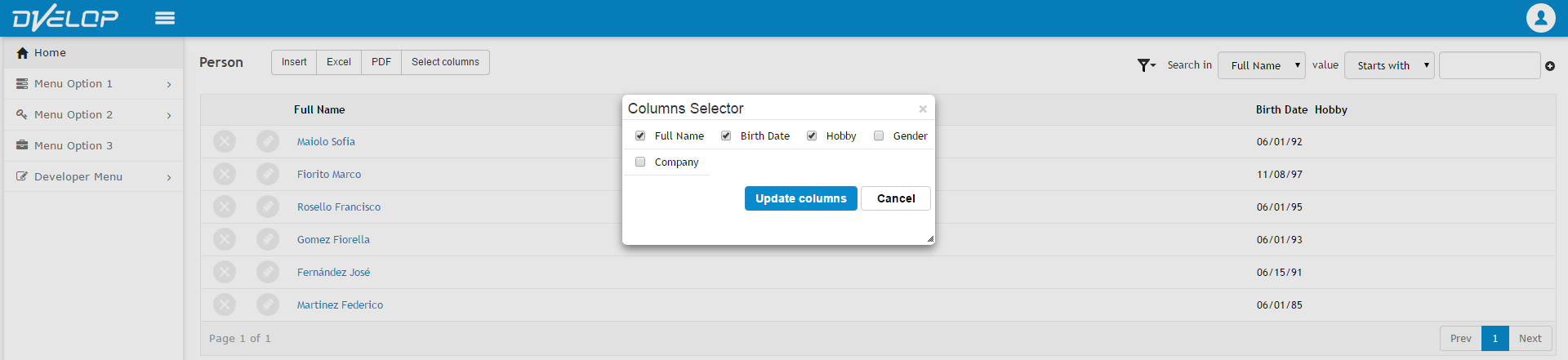
The attributes that are in the unchecked (invisible) are PersonGender and CompanyName (its property Visible by default is False) but PersonFirstName and PersonLastName are not in that list, because its property Visible is False.
If you want to read more information about about the Columns Selector, follow this link:
Column selector
Specifies whether the attribute will be included in the excel export or not. Only applies when StandardAction Export is enabled for this object.
Specifies whether the attribute will be included in the PDF report or not. Only applies when StandardAction Export Report is enabled for this object.
Specifies whether the attribute will be included in the CSV file or not. Only applies when StandardAction Export CSV is enabled for this object.
The values of the properties 'Include in Export', 'Include in Export Report' and 'Include in Export CSV' are <default>, True and False. <default> value will have the same behavior as the previous versions (will include it only if it is visible in grid). If the property is True, the attribute will be included and False will not be included.
Specifies whether to include column title filtering for this attribute or not. The possible values are:
- <default>: means that the value will be the one defined in WorkWithPlus Settings -> Filters -> This property on the proper filter (if this attribute is Character, it will consider this property on WorkWithPlus Settings -> Filters -> Character ).
- False
- True
If True, a new property named Title Filter Definition will appear. This property specifies whether the definition of this column filter will be taken from the Settings (same node as before within Settings) or will be customized for this attribute in particular. When this property has the value Custom, the following properties appear:
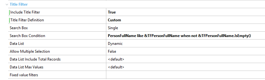
Specifies whether the variable will have a search box inside the column title filter. The possible values are:
- None: it won't include a search box
- Single: it will include one search box
- Range: it will include two search boxes, so that users can filter from some data to other data
Specifies the condition that will be used to filter that column records. If empty, the condition will be the default one (for example, it will search by like when it is a varchar or character).
Specifies whether the attribute will have a list of the possible values or not, in the column title. The options for this property are:
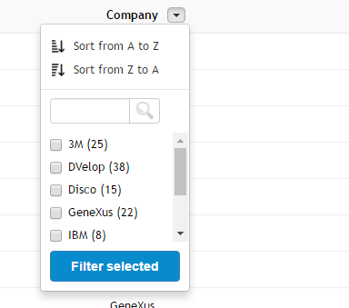
- Dynamic: means that it will include a list of real values of this column, and these search will be done on server side, which means that will display values from the current page and from pages that are not visible.
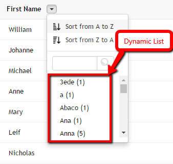
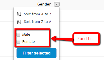
- Fixed: means that it will include a list of fixed items. This can be used when the attribute contains enumerated values, or is a combo box with fixed items. When this value is choosen specifically for an attribute, a new property will appear where you have to specify the fixed values that will appear on the list. If the attribute is combo, or has enumerated values it will take that values for the list automatically. If not, you would have to specify it separating the items with a comma. For example: 1:Male,2:Female (1 is the value and Male is the description).
- None: it won't include a list with possible values for that column.
Specifies whether the filters associated to the grid titles will have the option to select more than one option from the list or not. This property only makes sense when the property 'Data List' within the same node has the value 'Fixed List' or 'Dynamic List'.
Example of property 'Allow Multiple Selection' as True:
Example of property 'Allow Multiple Selection' as False:
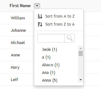
Specifies whether to include next to the data item, the amount of records which have that value. This only applies when the data list is dynamic.
Specifies the maximum amount of items to display in the dynamic data list.
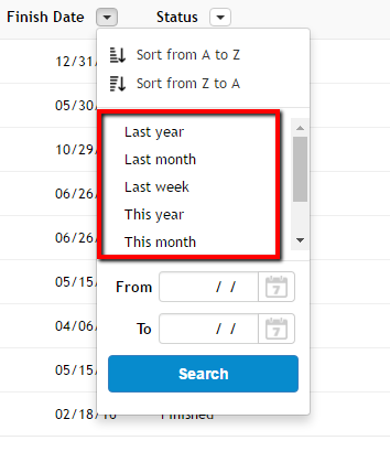
If you want to read more information about Column Filters, read the following link: Column Filters
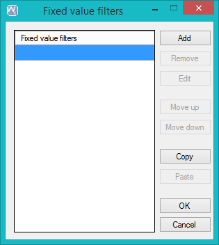
Specifies the filters with fixed values that will be added to the column filter. Let's use the grid attribute ProjectEstimatedFinishDate as an example for this property. When clicking in this property the first time, it will have no fixed value filters:
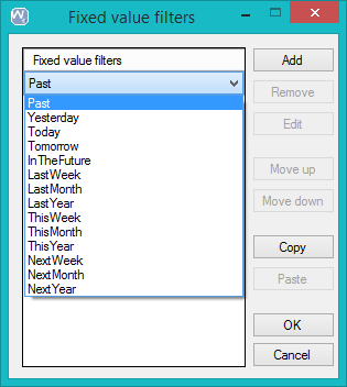
Click in Add button and for each filter you have to select one from the list:
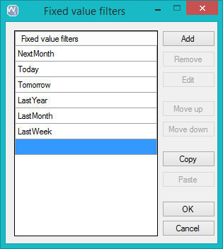
You can add as many as you want. In this example we added the following filters:
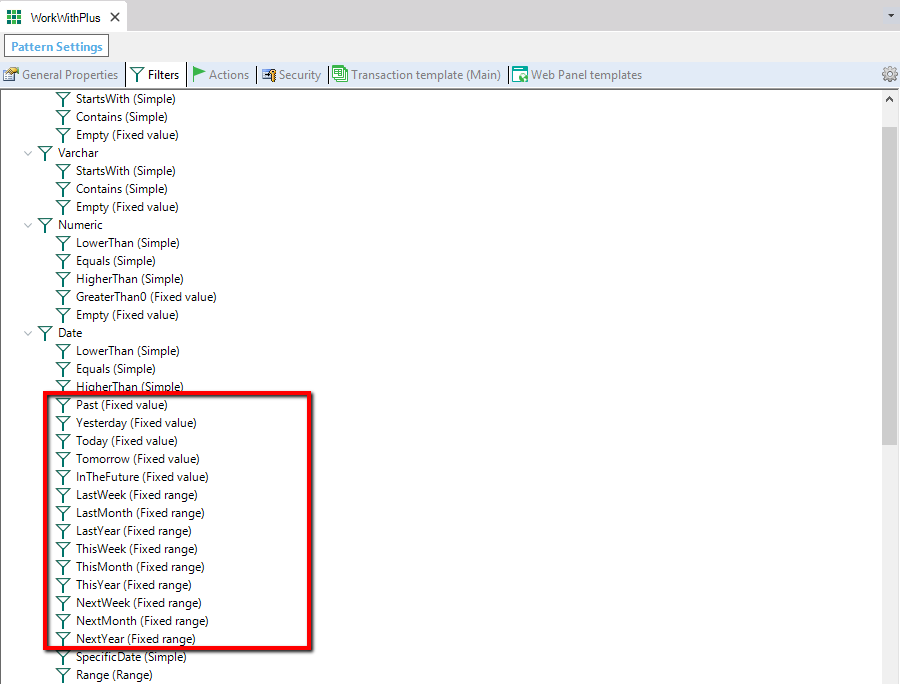
The available fixed value filters are the ones defined as operators with fixed values or fixed range within WorkWithPlus Settings -> Filters -> Operator
Then, at runtime the column filter will have what was defined in the column filter properties and also these filters for selecting them:
These properties are associated to grouping the records of a grid, and only applies when the property 'Group Field' within the 'Grid' node is 'Multiple options'. There is a sample of this feature in the following link: Grouped Columns
Specifies whether the end user will be able to group the records of the grid by this column.
Specifies the caption to be displayed in the group row, when selecting this column. The value <default> will take its value from WorkWithPlus Settings -> Labels -> 'Group Caption'.
In WorkWithPlus Settings -> Labels node -> 'Group Caption' property, you can mention the tags <ATT_DESCRIPTION>, <ATT_VALUE_DSC> and <GROUP_COUNT>.
Example 1:
- Group column: PersonStatus
- Value of 'Group caption': format('%1: %2', <ATT_DESCRIPTION>, <ATT_VALUE_DSC>)
- At runtime each group row will display:
- Status: Started
- Status: Finished
- Status: Canceled
Example 2
- Group column: PersonStatus
- Value of 'Group caption': format('%1: %2' (%3), <ATT_DESCRIPTION>, <ATT_VALUE_DSC>,<GROUP_COUNT>)
- At runtime each group row will display:
- Status: Started (74)
- Status: Finished (52)
- Status: Canceled (59)
Specifies the field that WorkWithPlus will use to group the records of a grid when selecting this column to group. In most cases, this property will be set as '<default>', which means that will use the attribute itself. But in some cases, for example an inferred attribute of another transaction, you can select here to choose by the FK in order to have better performance.
|
This Category is only visible when the Standard Action is inside a grid.
Specifies whether the action will be fixable at runtime by the end-user, fixed to the left of the grid, to the right, or not fixable.
Specifies whether the action will be fixed when the page loads (with the settings of the end-user by default) or not.
|
|