Every node in WorkWithPlus, which is going to become a control the Web Form, will have the properties mentioned below.
If the Table/Panel which contains this control is Responsive, the properties that will be available are the following:
They specify the width of the cell where the control will be displayed, for each different browser size. The possible values for these properties are part of the Bootstrap framework. Bootstrap specifies that you can split a row in up to 12 columns, so one control can occupy from 1 of 12 (100/12%) columns to 12 of 12 columns (100%).
So, the options are: 8%, 17%, 25%, 33%, 42%, 50%, 58%, 67%, 75%, 83%, 92% and 100%.
With these properties, you can set that some control occupies 50% when the browser is Large but 100% when the browser is Extra Small for example, so it allows you to reorganize the controls within the page.
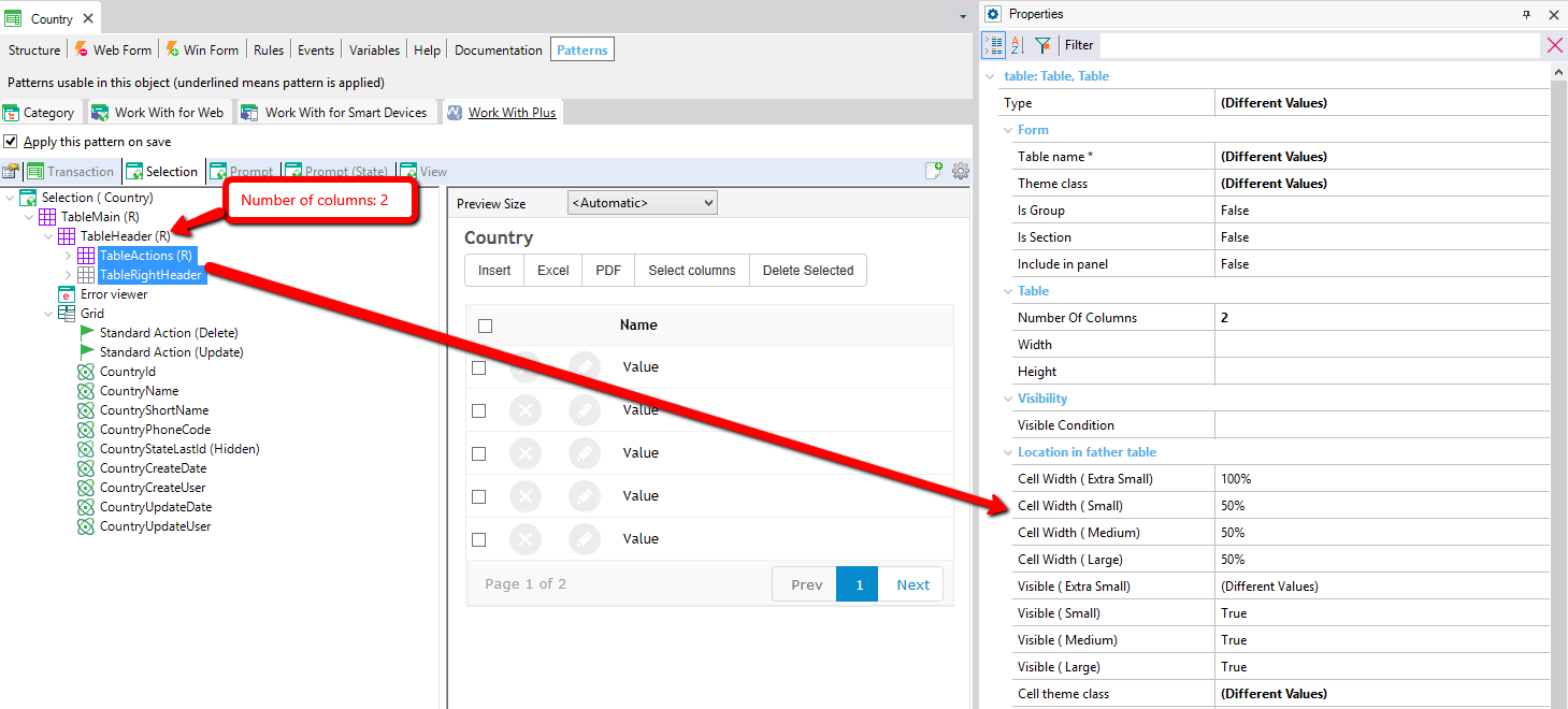
When you have a table of type Responsive and you set the property number of columns to 2 for example, WorkWithPlus will automatically set to all the nodes that are inside that table the property Cell Width (Small), Cell Width (Medium) and Cell Width (Large) to 50%.
But you can change the properties as you wish. For example, the first Table could occupy 50% in Medium and 75% in large browser.
With these properties, you can set that some control is visible when the browser is Large and not visible when the browser is Extra Small for example. The possible values for these properties are true or false.
The properties Cell Theme Class, Start Col/Fst Avail and Merge with previous cell are explained below because they are available in both cases (when its parent is Regular or Responsive).
If the Table/Panel which contains this control is Regular, the properties that will be available are the following:
Theme class of the cell which contains the control.
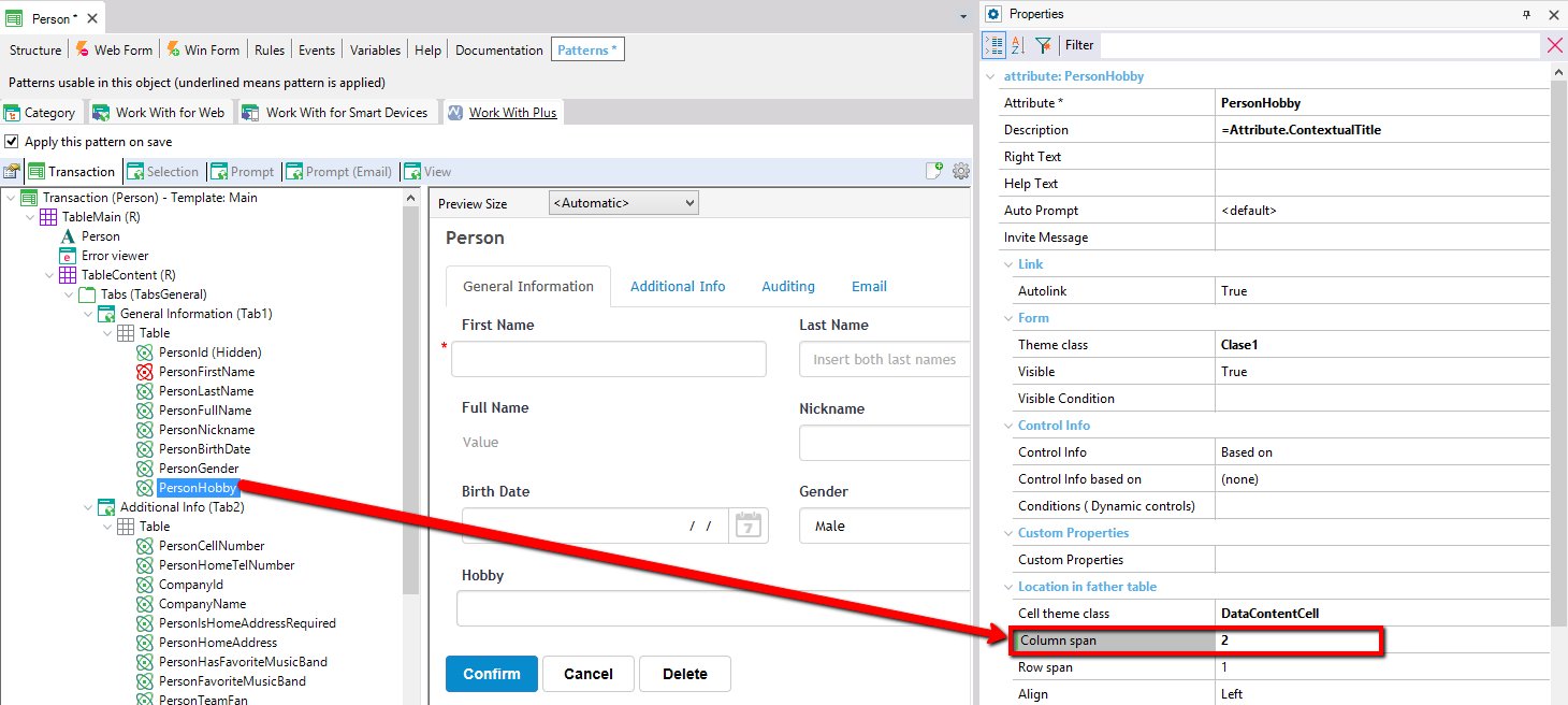
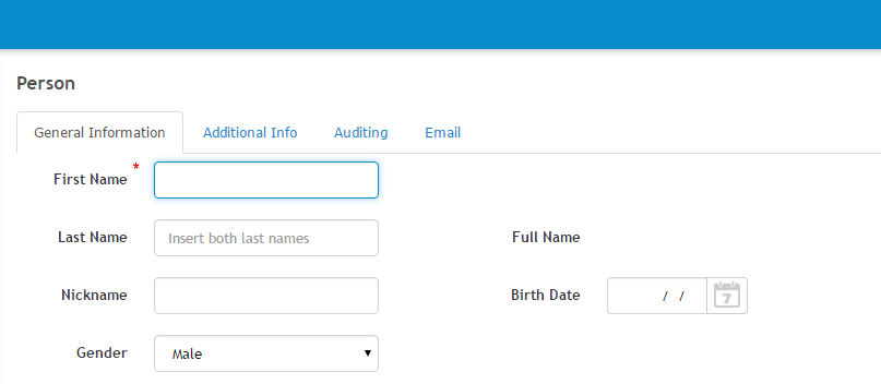
Amount of columns that the cell which contains the control will occupy. This could be useful when you have multiple rows aligned in a certain amount of columns and you want that one control (attribute for example) occupy more that just one column because it is much larger than the others.
In the example below, we have an attribute PersonHobby that is larger than the other attributes. In order to make this transaction attractive in its look & feel, we set that PersonHobby occupies 2 columns instead of one, setting its Column span as two.
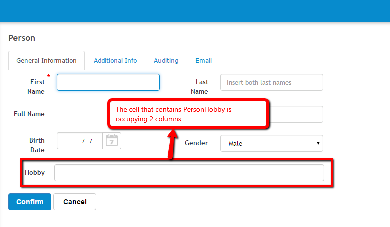
We run the application and visualize the results:
Amount of rows that the cell which contains the control will occupy. It is analogous to Column span but with rows.
Set the control's alignment within the cell. The options are Left, Right or Center.
Set the control's vertical alignment within the cell. The options are BaseLine, Bottom, Middle or Top.
Specifies the number of column where the control will be layout, counting from the next cell unoccupied. If this property is 0, the control will occupy the next cell available.
In the example above, if we would like that PersonLastName will be layout in the first column of the next row, and PersonName to occupy only one column, we would have to set PersonLastName's Start col/Fst property avail in 1 or 2. We would obtain the following results:
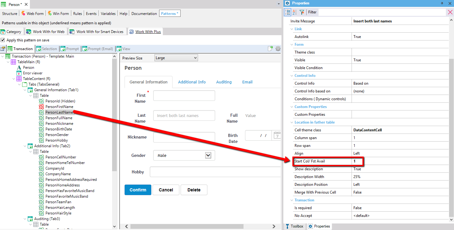
This means that the attribute PersonLastName will be layout in the second column available within the object. We run the application an visualize the results:
Specifies whether to show the description associated to the control or not. If True, a textblock next to control itself will be displayed.
Specifies the width of the description.
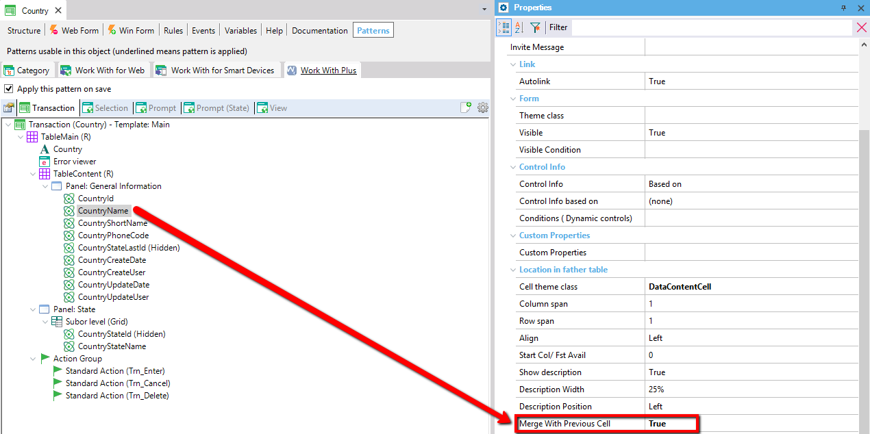
Specifies whether to merge this cell to previous cell or not. This will automatically create a table and merge both cells (previous one and this one) into the table, so that this controls will be displayed one right next to the other. This is useful when you want to show two attributes together (FK and the inferred attribute that describes it), or you want to show an attribute or variable and an action next to it.
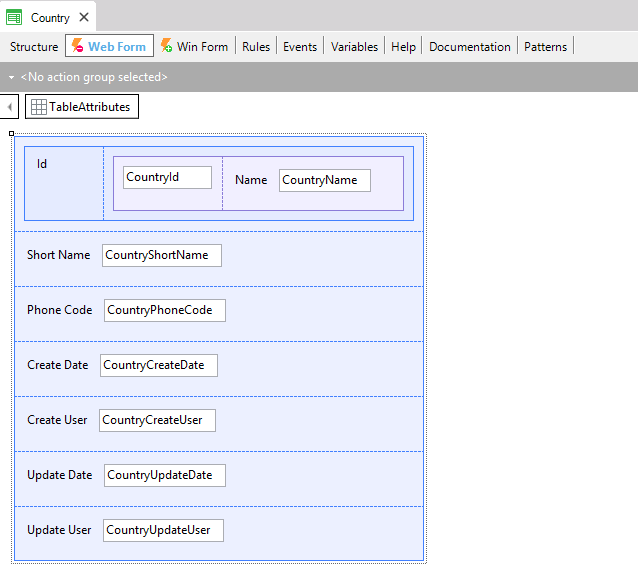
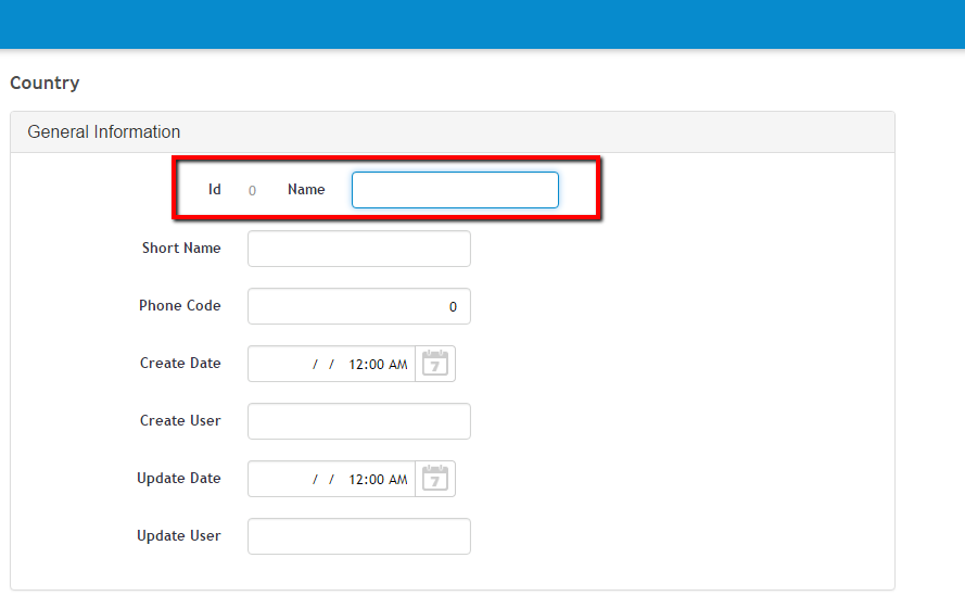
For example, if we want to show CountryId and CountryName next one it, we assign Merge with previous cell in true to CountryName. We also set Show description as false because we only want to show its value:
Then we save the object, and view web form of Transaction Person:
Finally, we visualize the results at runtime:
|