|
As of SmartDevicesPlus 6, this control was removed from SmartDevicesPlus controls library.
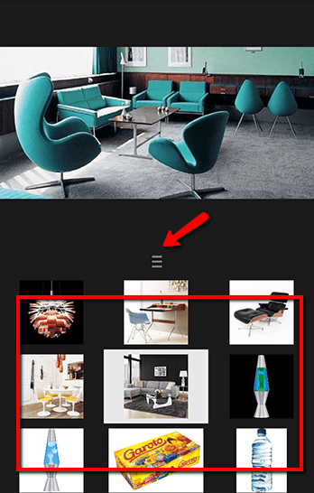
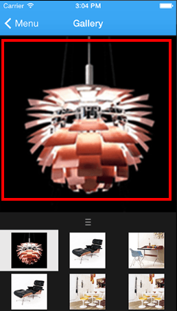
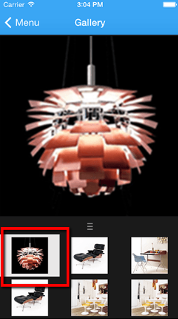
SmartDevicesPlus Image Gallery Control uses Infragistics NucliOS Library to build an advanced and stylish Image Gallery. In SmartDevicesPlus Image Gallery the user can select an image by browsing through the thumbnails sections, or can directly swipe the image to switch between the gallery's images
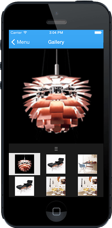
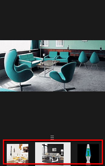
In addition, SmartDevicesPlus Image Gallery thumbnails section can be adjusted to show only 1 row of images by dragging the thumbnails section separator. In that case thumbnail section will scroll horizontally.
SmartDevicesPlus Image Gallery User Control has to be applied to a GeneXus Grid, to enable it first you'll have to add a GeneXus Grid in your SDPanel and then select "SmartDevicesPlus Image Gallery" in the grid's "Control Type" property.
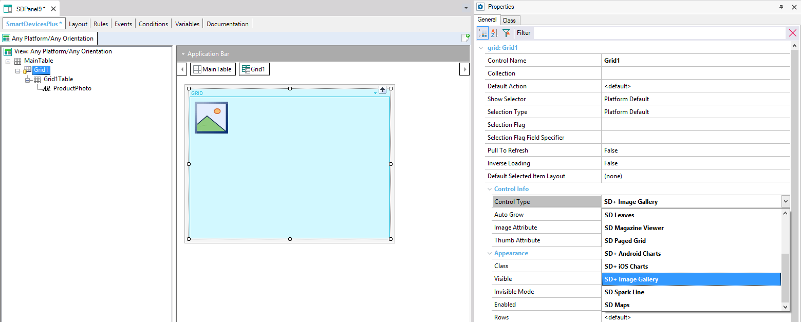
After this, you will see the SmartDevicesPlus Image Control properties displayed in the property grid.
This property lets you customize the attribute that will be used as the gallery's main image.
When using a grid based on a SDT, the image attribute will be disabled, and the "Image Field Specifier" property will be enabled to let you choose the SDT field containing the category data.
This property lets you customize the attribute that will be used as the main images thumbnail. Thumbnails are displayd
When using a grid based on a SDT, the image attribute will be disabled, and the "Image Field Specifier" property will be enabled to let you choose the SDT field containing the category data.
This feature is compatible with iOS platform.
|