|
As of SmartDevicesPlus 6, this control was removed from SmartDevicesPlus controls library.
Please check documentation for Chart User Control
SmartDevicesPlus NucliOS Chart User Control uses Infragistics Library to build several types of charts for the iOS platform.
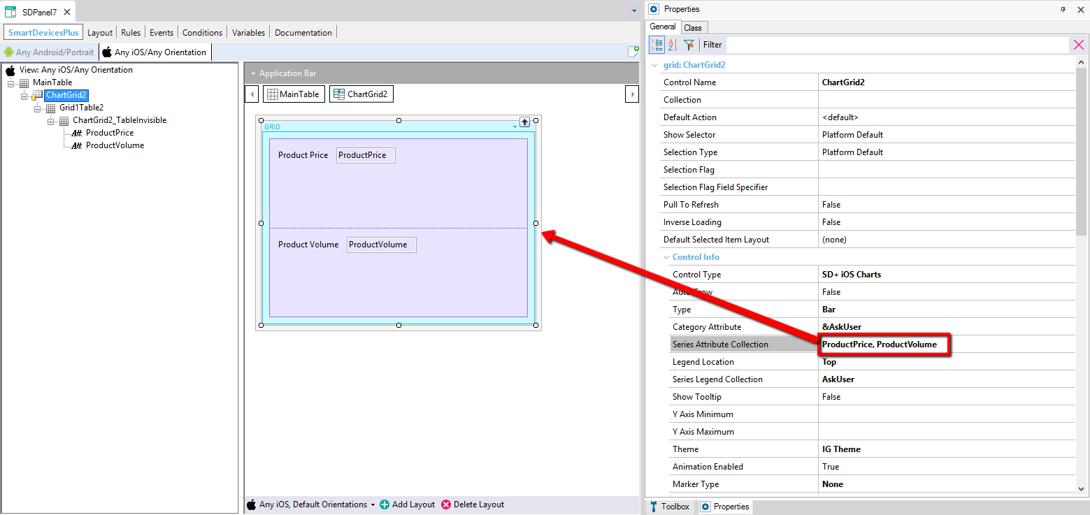
SmartDevicesPlus NucliOS Chart User Control has to be applied to a GeneXus Grid, so in order to enable it first you'll have to add a GeneXus Grid in your SDPanel and then select "SmartDevicesPlus iOS Nuclios Charts" in the grid's "Control Type" property.
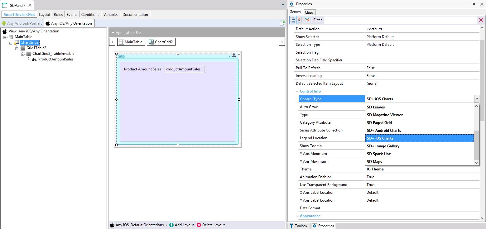
After this, you will see the SmartDevicesPlus NucliOS Chart User Control properties displayed in the property grid.
This property is a Combo that lets the you choose the Chart Type that will be displayed, ie: you could choose to build a "Area" or a "Pie" chart.
The supported chart types are:
- Area
- Bar
- Column
- Line
- Point
- Spline Area
- Spline
- Step Area
- Step Line
- Radial Column
- Radial Line
- Radial Pie
- Pie
- Stacked 100% Area
- Stacked 100% Bar
- Stacked 100% Column
- Stacked 100% Line
- Stacked 100% Spline Area
- Stacked 100% Spline
- Stacked Area
- Stacked Bar
- Stacked Column
- Stacked Line
- Stacked Spline Area
- Stacked Spline
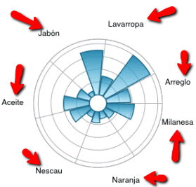
NucliOS Supported Chart Types
This property lets you customize the attribute that will be used to fill the category of the chart. Depending on the type of the chart, the category represents the data shown as the "X axis" on any axis based charts or the element on any radial based chart.
When using a grid based on a SDT, the category attribute will be disabled, and the "Category Field Specifier" property will be enabled to let you choose the SDT field containing the category data.
When using a chart you may want to obtain a chart that contains one or multiple series. This property lets you customize the attribute (or field if you are using an SDT based grid) used to obtain each serie's value.
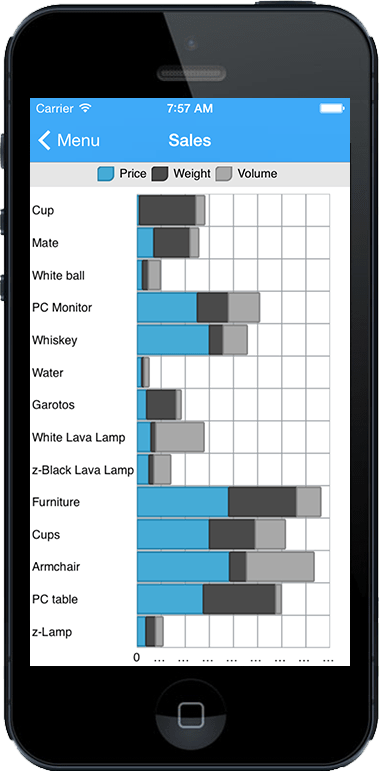
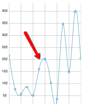
For example, if you want a lines chart that shows the product sales for each product of your company, you'll want to crate a Single Serie line chart. For this, you'll have to write "ProductSales" on the "Series Attribute Collection" property. By doing this you sholud obtain a chart similar to the following:
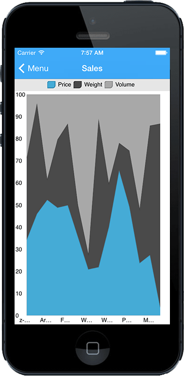
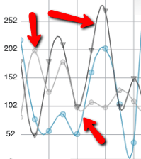
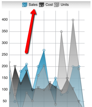
Then, if what you want is a chart that shows your products sales compared with the product production costs and the product production units, you'll have to write each serie attribute separated by a comma: "ProductSales, ProductProductionCosts, ProductProductionUnits" on the "Series Attribute Collection" property. By doing this you sholud obtain a chart similar to the following, where each line represents one of the selected series:
Important: If you are using an Attribute based grid, for each attribute you write in the "Series Attribute Collection" property you will have to manually add the attribute to the grid's layout
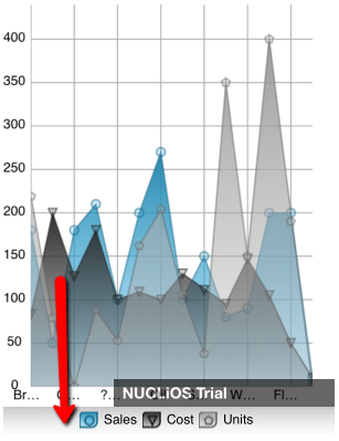
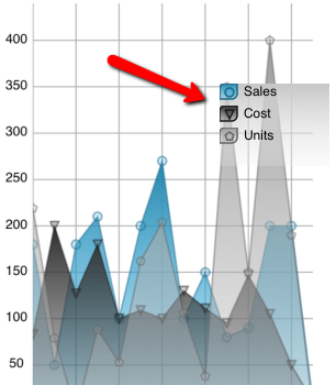
Legend Location is a combo property that lets you choose the position where the series legend will be placed. You can choose between "none", "top", "bottom", "float".
- None
The legend is not displayed.
- Top
- Bottom
- Float
When legend location is set to either "top", "bottom" or "float" you have to write the legend text for each serie you want to display. When more than one serie is present, you must separate each legend with a comma.
In our example, we wrote "ProductSales, ProductProductionCosts, ProductProductionUnits" on the "Series Attribute Collection" property, so this means we'll have to write three texts on the "Series Label Collection" property, one for each serie e.g. "Sales, Cost, Units"
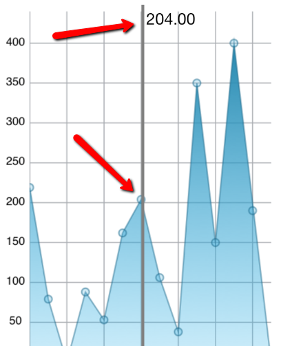
This property enables or disables the tooltip of the chart. The tool shows the current value and is displayed by doing a long press on any item of the chart.
This property allows you to customize the position of Y Axis minum value. This will change the position where the X Axis apears.
By default Y Axis Minimum is set to empty which means the minimum will be calculated depending on the series values. You can manually set a static value for the Y Axis Minimum by entering a number e.g. "10", or you can set the minimum dinamically by writing down the name of a variable which in runtime will contain the minimum value e.g. "&YAxisMin"
This property allows you to customize the position of Y Axis maximum value.
By default Y Axis Maximum is set to empty which means the maximum will be calculated depending on the series values. You can manually set a static value for the Y Axis Maximum by entering a number e.g. "100", or you can set the maximum dinamically by writing down the name of a variable which in runtime will contain the maximum value e.g. "&YAxisMax"
This property enables or disables the chart initial "data fill effect" animation.
This combo property lets you change the marker used to represent the data in the chart. You can choose between:
- None (marker is not used)
- Automatic
- Circle
- Diamond
- Hexagon
- Hexagram
- Pentagon
- Pentagram
- Pyramid
- Square
- Tetragram
- Triangle
For example, a circle marker looks like:

And a triangle marker:

This property inverts the X axis values. This means the first category is displayed on the right of the chart, and the last category on the left.
This property enables the transparent background of the chart.
This combo property sets the selection mode of the Pie Chart. It can be set to:
- None: Selection is not available on the chart
- Single: Only one item of piece of the pie chart can be selected
- Multiple: Any piece of the chart can be selected
This property let set the inner radius of pie charts so you can customize how they will displayed.
This combo property sets the zoom mode. It can be set to:
- No Zoom: disabled
- Full Zoom: enabled
This combo property lets you choose the category labels positions relative to the X axis. It can be set to:
- Default
- Outside Top
- Outside Bottom
- Oustide Left
- Outisde Right
- Inside Top
- Inside Bottom
- Inside Left
- Inside Right
This combo property lets you choose the chart value axis labels positions relative to the Y axis. It can be set to:
- Default
- Outside Top
- Outside Bottom
- Oustide Left
- Outisde Right
- Inside Top
- Inside Bottom
- Inside Left
- Inside Right
This property lets you customize the way a date is displayed when using a Date attribute as the chart category attribute.
This combo property lets you choose the general look and feel of the chart. Each theme uses its own colors, gradients, fonts, etc.
The available themes are:
- Default
- Dark Theme 1
- Dark Theme 2
- Dark Theme 3
- Dark Theme 4
- IG Theme
- IG Theme Dark
- Gradient IG Theme
- Gradient IG Theme Dark
- Gradient Finance Theme 1
- Gradient Finance Theme 2
- Gradient Finance Theme 3
- Gradient Finance Theme 4
- Gradient Finance Theme 5
NucliOS Themes
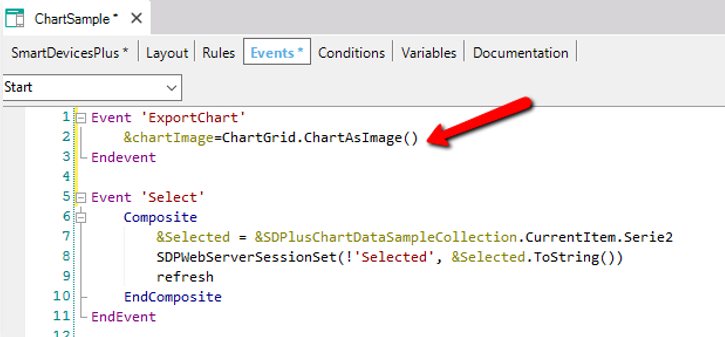
This feature add the possibility to take a screenshot of a Chart. In this way, developers can add a button in screens where they have Charts and let the users to export the chart as an image.
To use this property is necessary to include the following code in an Event (for example from a button):
|